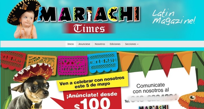
 (Blog in spanish / english (english below) Recientemente fui a un interesante evento fotográfico en una galería de arte ubicada en East Harlem, mejor conocido como Spanish Harlem. En la galería encontré una revista llamada Mariachi Times, una revista de "cultura Latina" en NY. La revista no estaba mal, así que decidí visitar la página de internet de esa publicación para saber más sobre ellos, lo que hacen y representan. La página es un desastre. Las gráficas son malas en cuanto a la ejecución y el diseño, parecen haber sido creadas por alguien que no sabe usar Photoshop, además de que la composición es desagradable. Aun con esos problemas, lo que me preocupa más es la forma en la que están representando a la cultura latina. Como pueden ver en la toma de pantalla (la imagen que encabeza este texto), encontrarán un bebé con un sombrero de Mariachi (porque eso es “claramente” lo que se lleva en México), que por cierto es un bebé de ojos azules (porque poner un bebé de ojos café en la portada de Mariachi Times?) Bajo el título, una imagen en rotación muestra un perro Chihuahueño también con un sombrero, y un letrero grande que grita TAMALES!, todo con unos colores que no van muy bien juntos y visualmente, muy pesados. Si quieren dar su opinion, visiten el sitio ustedes mismos y comenten y compartan que opinan en la sección de abajo. La pagina es www,MariachiTimes.com =====ENGLISH================================================ I recently attended an awesome event in a gallery located in East Harlem, otherwise known as Spanish Harlem. At the gallery I found a publication called Mariachi Times, which is a 'Latins in NY' type culture magazine. The actual magazine didn't look too bad at all, so i figured I would check out their website to learn more about who creates the magazine and what they are about. Well, the website is a hot mess. Not only are the graphics bad in terms of the design, but they are put together poorly, as if someone with bad photoshop skills made them. While that is bad, as far as I'm concerned the bigger issue here is the way they are portraying Latin culture. If you see the screenshot I added, you can see a baby wearing Mariachi Sombrero (because that's what babies wear in Mexico), and of course its a blue eyed baby (because, why would you put a brown eyed baby on the cover of the MARIACHI TIMES?). Under the title, a rotating image, shows either a Chihuaha puppy, also wearing a sombrero, or a big sign that says TAMALES, all very color clashing and layed out in a way that feels like knives to the eyes . Feel free to visit the site yourself and let me know any comments in the section below. The website is www,MariachiTimes.com 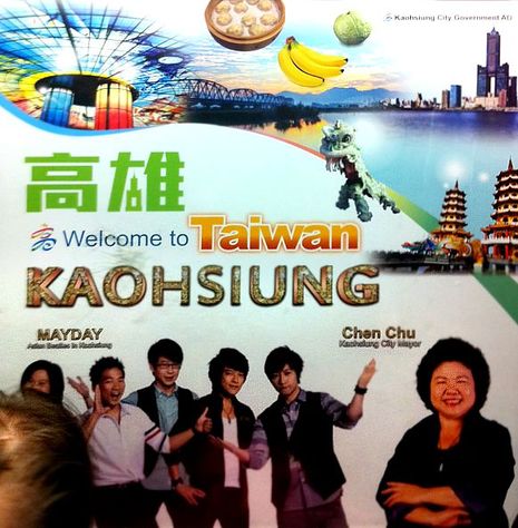
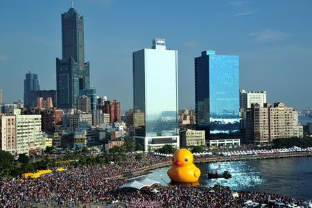
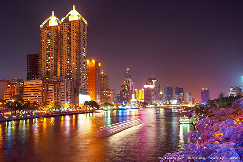
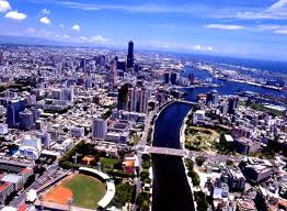
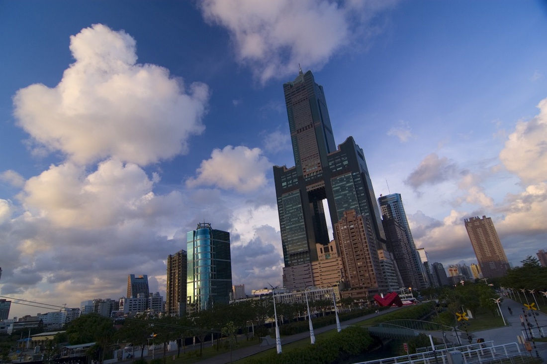
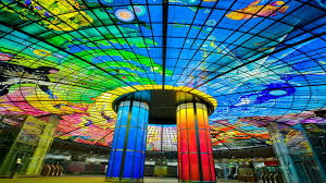
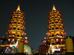
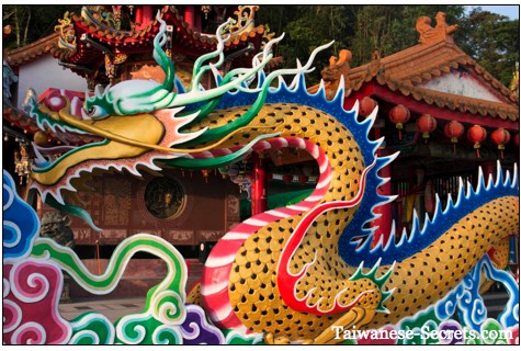
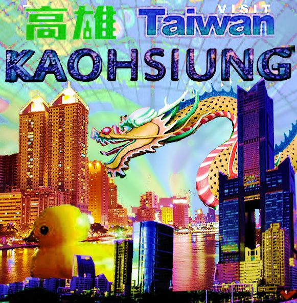
I was on my way to rehearsal riding the NYC subway, when this poster caught my eye, not because its a great poster, but because it was right in front of me and it looked like something a design student with very little talent might have done for a school project. First I wondered, how did this make it all the way into the subway? Then I thought, WHO approved this to go to print?? The lettering was small, the pictures oddly proportioned and featured the mayor of the town and a boy band more than the attractions of the city being advertised, and a tiny dragon (randomly dropped in the layout), spoke little to me about the culture of this place. You would think someone qualified would need to approve it before letting it go public and having to pay a good chunk of change to put it on the trains. Under normal conditions, I would have just ignored the poster and turned away in search for something more visually appealing, however the train was crowded and I had to go all the way downtown forced to stare at this poor piece of design work, which brought me to carefully analyzing it. While the poster has some seemingly right ingredients: some typical fruits, a few people who are ambassadors to the city, an important political figure, and a bit of their attractions, the mix just isn't right. It truly does not speak to a prospect tourist. Perhaps this helps you see my point. If there were an Ad of the city of New York, done with the same concept, it would be something kind of like this: 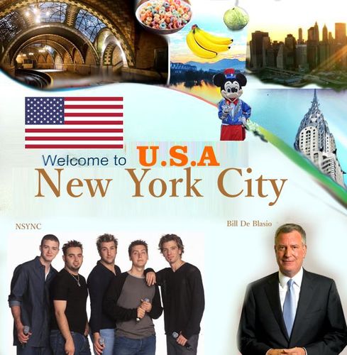 Awful right? Being aware that this most likely was a mistake, meaning that the city that they are promoting couldn't possibly be THAT bad, and it was more a poor decision on the selection of which ad to run, I decided to do some research on the town once i made it back home. Turns out, Kaohsiung IS an awesome city, and from all that I found, totally worth visiting. It is culturally rich, and full of history, and it is also the home to very avant garde architecture as well as random cool things like a GIANT rubber duck that sits on the river. So with my new knowledge about the city, I decided to create a mock ad that might represent my feelings about this city a little better than what their poster did.
In conclusion, no, I don't have all the facts on hand but I'm pretty sure, that showing bananas, a boy band that is allegedly as good as The Beatles (and state it on the poster), and the warm and cozy look of the towns mayor all combined, were definitely not the best choice to try and lure new visitors to spend their hard earned dollars on a vacation there!
Some people say your headshot is the first impression you'll make when it comes to an audition, or casting, and this may very well be true. however this doesn't mean you need to spend everything in your piggy bank in order to get the perfect one to take in (specially) for your potential first few jobs! Granted, you should probably not have take a selfie, or a random snapshot where you think you look great (I have seen some people use prom pictures and what not for a headhsot) , but there is no need to pay more than maybe $100-$200 for a great looking shot. That's where the magic of photoshop can come in extremely handy. 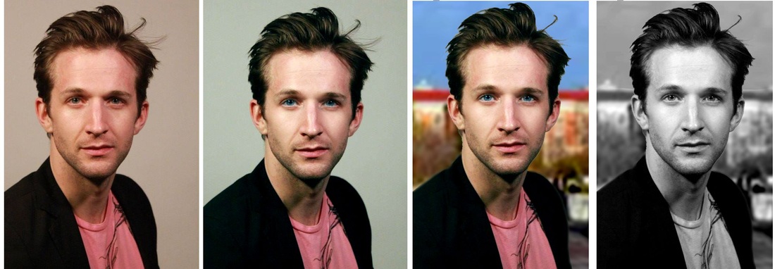
Take a decent shot that shows your features and transform it lightly to look like a more professional studio shot. of if you want, take it outdoors!
Considering the following facts...
a) hiring a photographer who has a lot of lighting equipment (which probably needs to be in their personal studio) may run anywhere between $150-$400, b) an outdoor session may be not only out of the question because of the winter, but because they can be more expensive, and its a pain to walk around with everything you and your photographer may need during the shoot, c) you may potentially already be a starving artist, and the job you may get (thanks to your headshot) could possibly not even pay for the cost of your photographer's fees after an entire month of work ...then you might want to consider just finding a photographer with the right eye and some decent retouching skills. As you can see in the example above I show the transitional steps between a 'normal' ok shot and the finished product a beautiful headshot. I took that shot with indoor 'home' lighting and no flash, and worked three different versions with very mild photoshopping that mimic the results of proper (and very expensive) studio lighting. Also for those outdoor headshot lovers, i did an outdoor version. Having an idea of what expensive headshots look like is definitely important, that way trying to achieve the same results is somewhat easier. You can do this by simply googling headshots of famous people, who obviously have access to the best photographers. Another key thing is having good material to start from. So I encourage you today to find yourself a friend who knows how to use photoshop, or an affordable photographer who is willing to photograph and retouch your image for a reasonable price, or even maybe just photoshop a picture you or a friend of yours took for you for a flat fee. D a e v i d M e n d i v i l is a NYC-based multi-disciplinary artist in the visual and performing arts, creating expressive works through dance, music, photography, painting, film & design. www.Daevid.net Courtesy of New York City's inclement weather, there are times that I'm compelled to staying put at my apartment and figure things to do. However, not always i want to paint, and not always I want to dance, and I definitely not always have a model to shoot with wardrobe at hand to choose from and create the images I might imagine. That's when I go into my archives. Through the years I have accumulated lots and lots of photos and videos. as well as paintings that are undone. Some of them are good, some of them are bad, and some of them are ugly, but they all hold one thing in common: They all have potential.
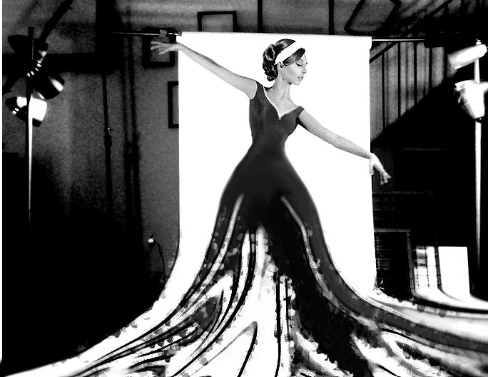
Here, I took a picture I wasn't too crazy about, but it definitely had something special. I've blurred the face of the victim, to protect her identity.
I kind of did like the general concept of the photo, however as a finished item, I was not sold. Luckily for me, from the comfort of my own home, and without even leaving my chair, I was able to transform the image from something simple, to something far more magical and inspiring. So whenever I am bored, but need something to be inspired, I go through my own archives, and find something that speaks to me and inspires me on the spot. I might perhaps elaborate on this and turn it into a painting in the future. D a e v i d M e n d i v i l is a NYC-based multi-disciplinary artist in the visual and performing arts, creating expressive works through dance, music, photography, painting, film & design. www.Daevid.net |
www.Daevid.net
Connect w/me:
Categories
All
Archives
August 2020
|


 RSS Feed